✦
GIRLS WHO CODE
× My role: UX/UI designer & Illustrator
× Type of project: Interactive kiosk app | Branding
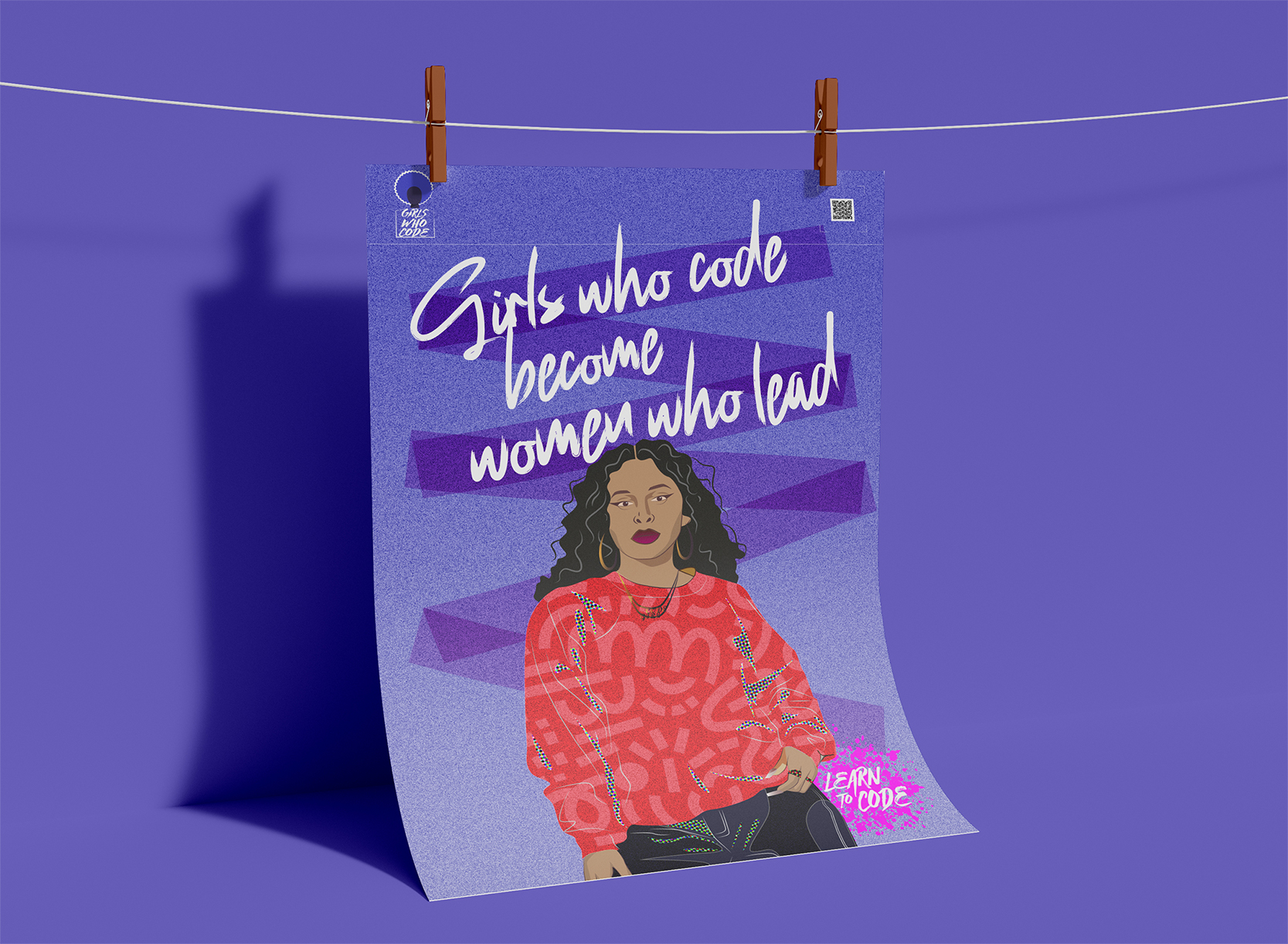
An kiosk app, visual identity, branding and advertisement posters were developed with the purpose of addressing the lack of diversity and inclusivity in the design field, focusing on the organization, Girls Who Code.
× Full case study upon interview ×
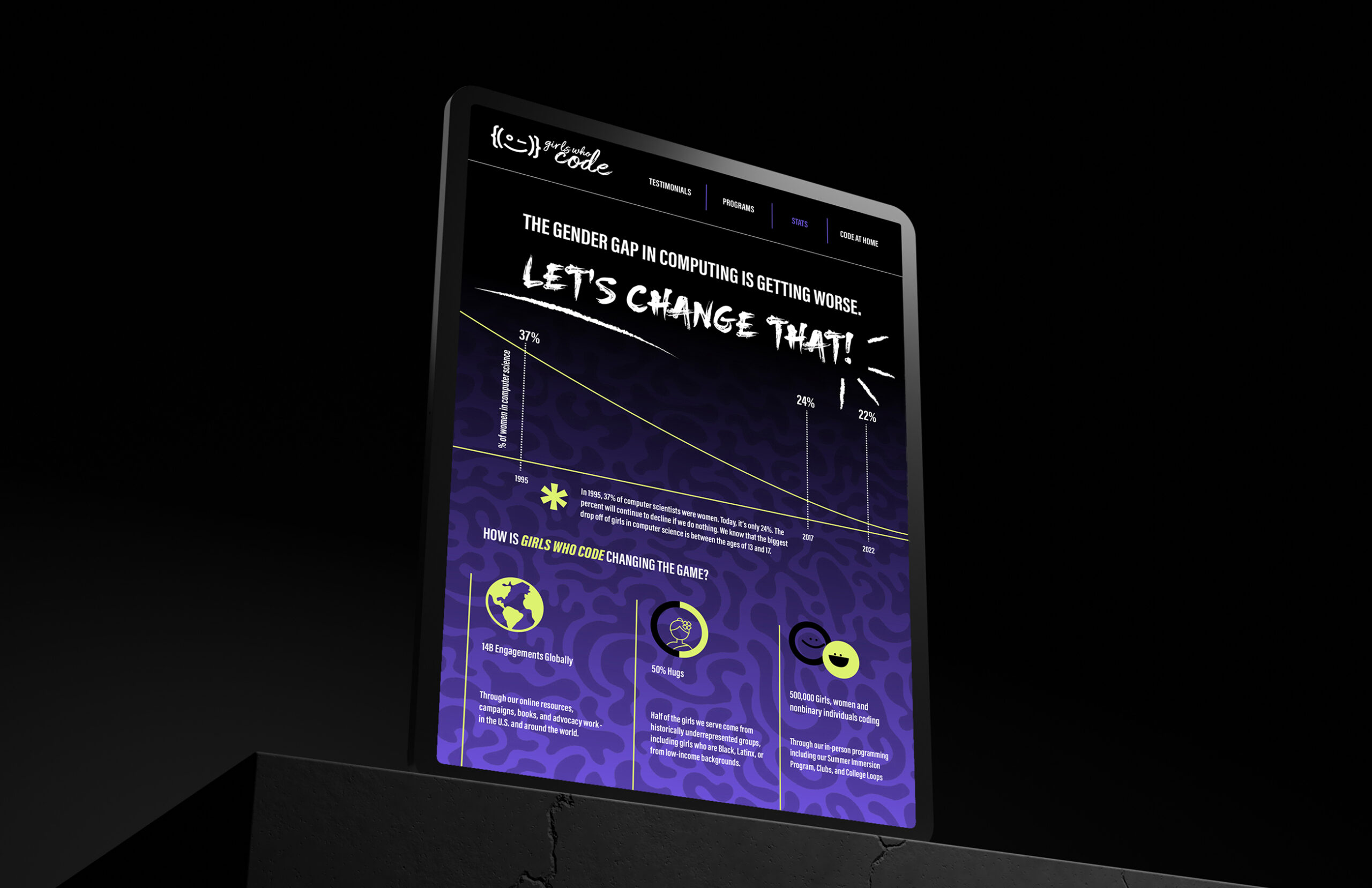
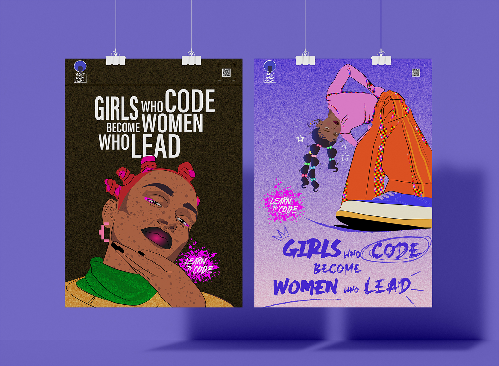
The gender gap in computing is getting worse!
Our app and visual identity aim to enhance accebility to information about girls and women in tech and to incentivate young girls to be part of coding programs by exposure to information about the field.
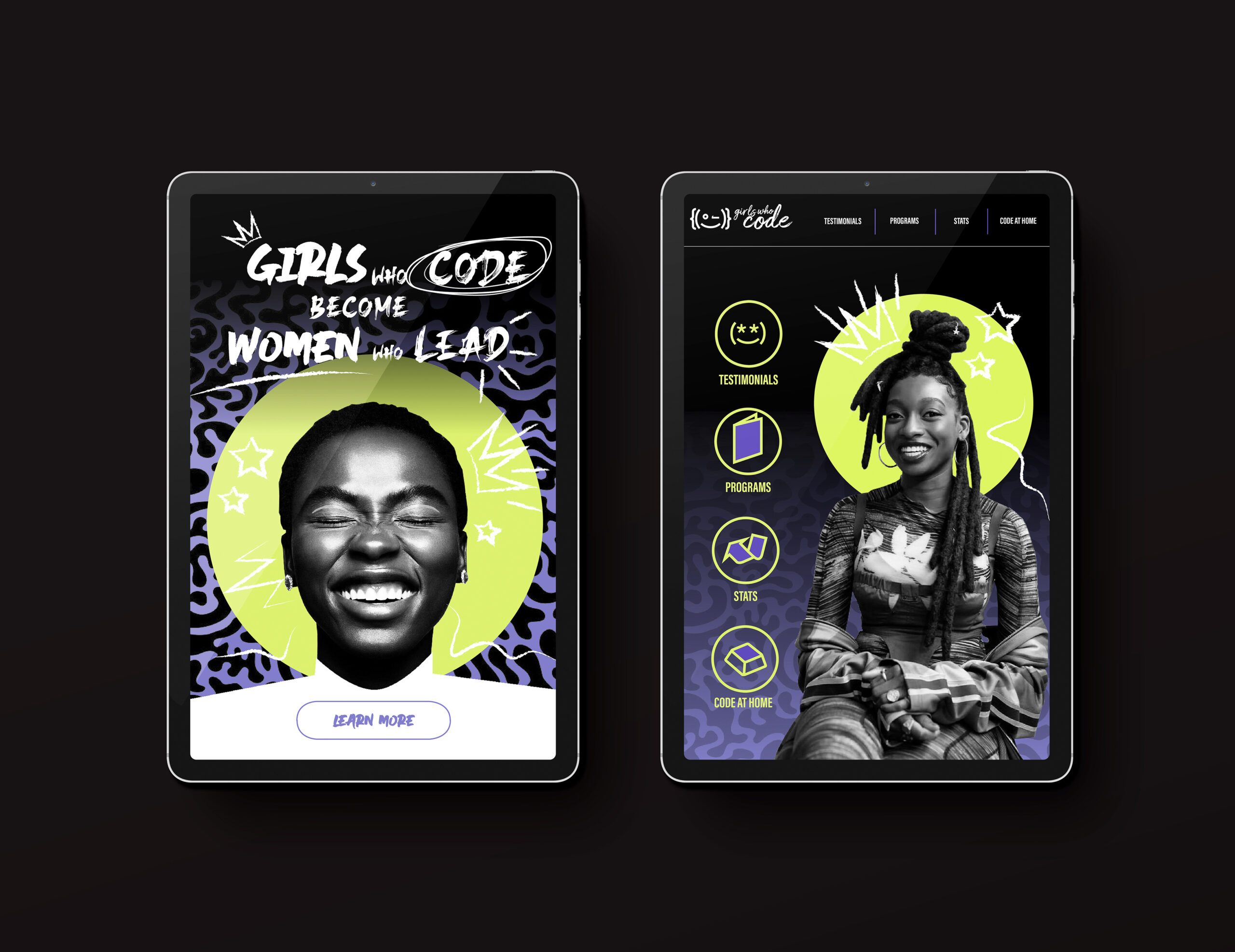
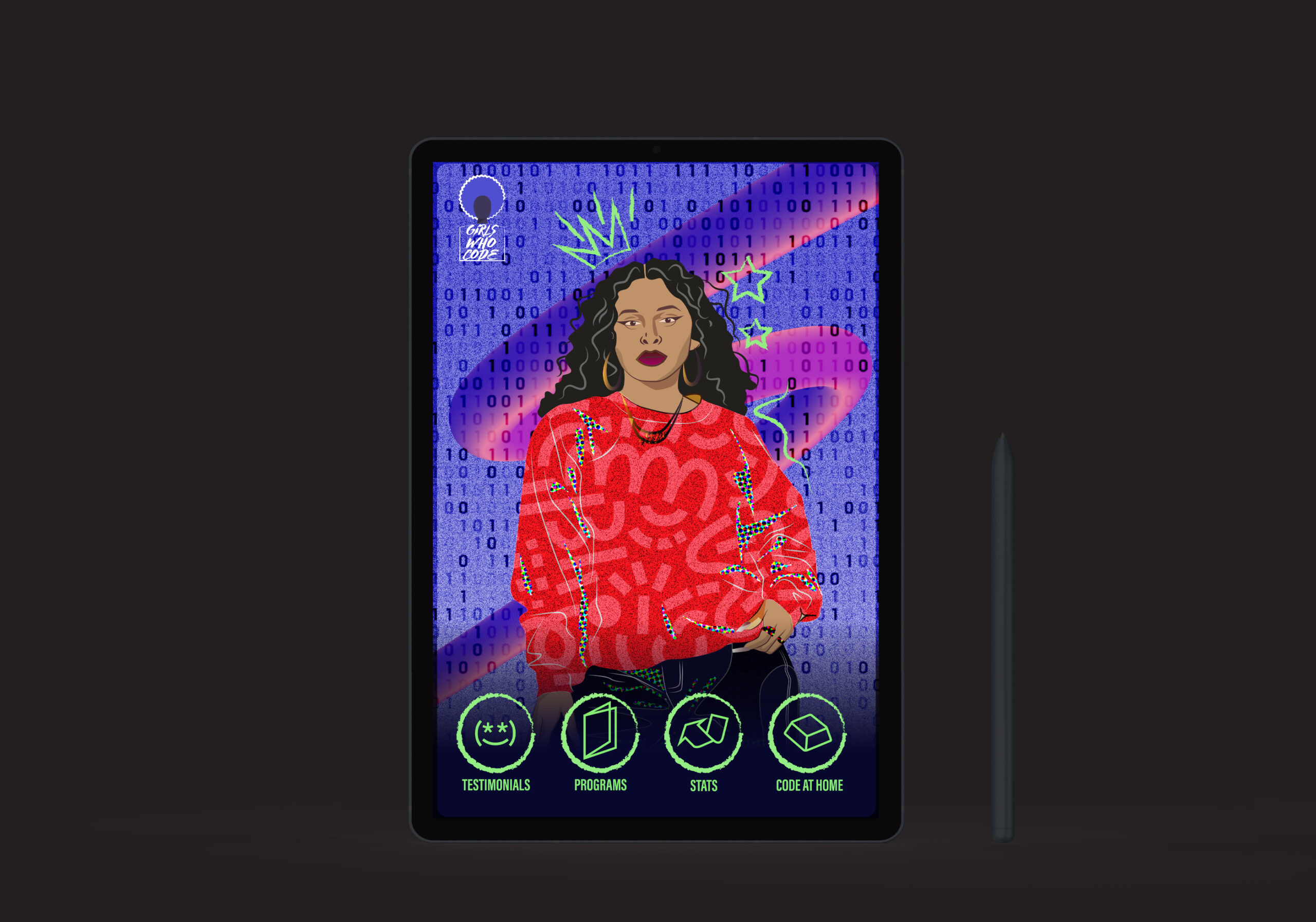
The eye catching homepage
The homepage reflects the youthful and refreshing qualities that our target audience are attracted to!
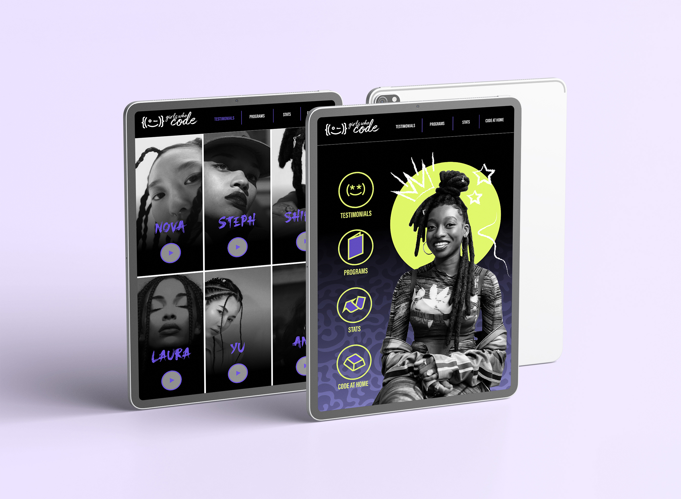
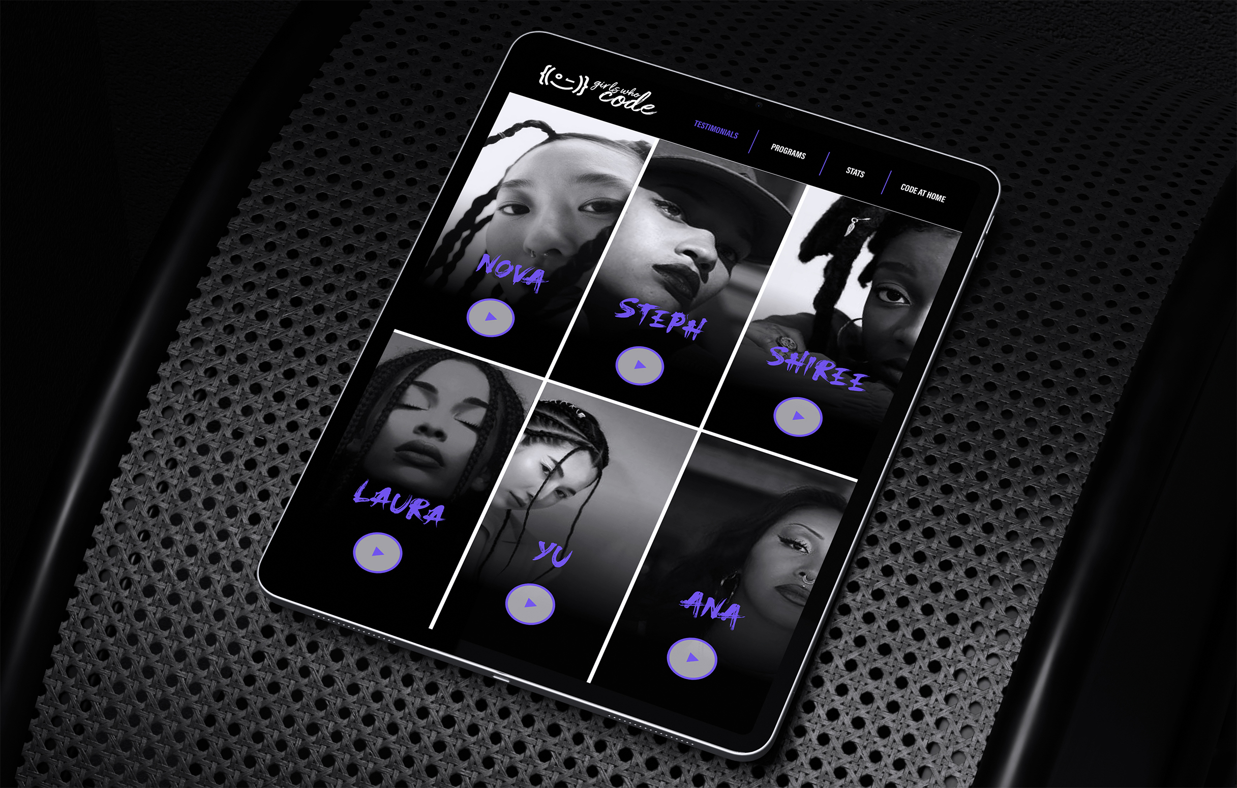
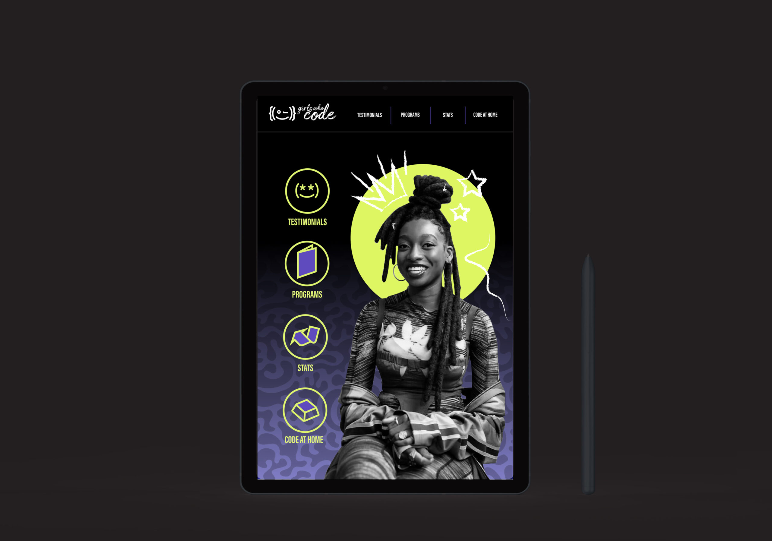
Testimonials and impacts
95% of the testers feels more attracted to video interfaces that create an opportunity for story-telling and self expression. This is the reason why our testimonials page is a series of short videos featuring women in tech.
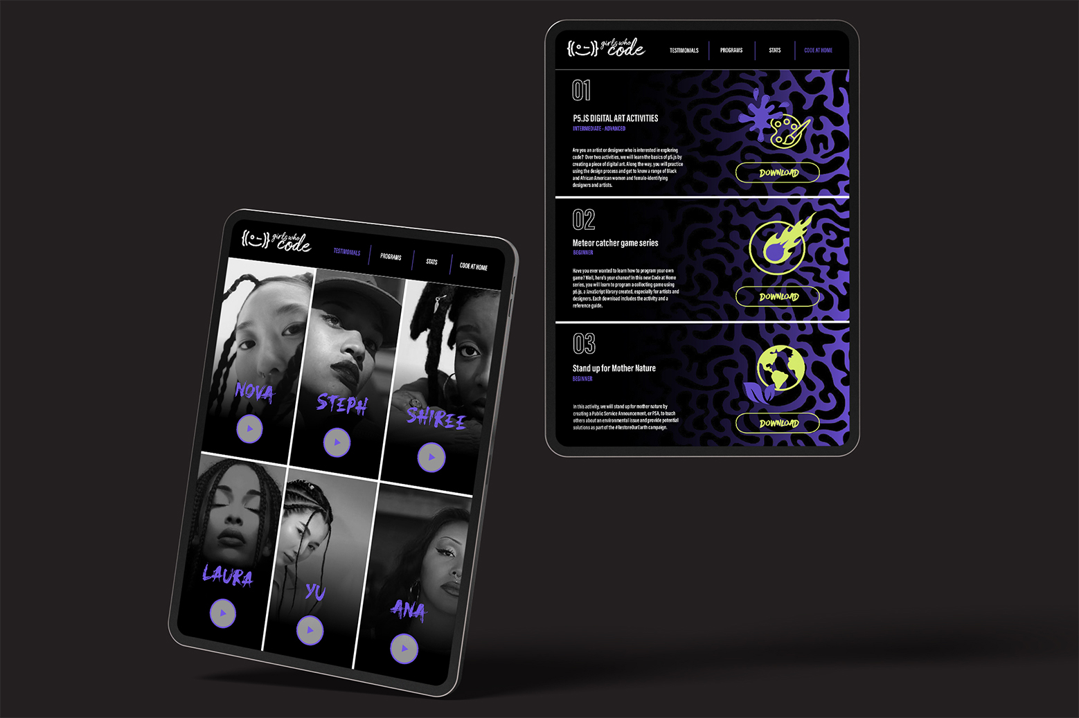
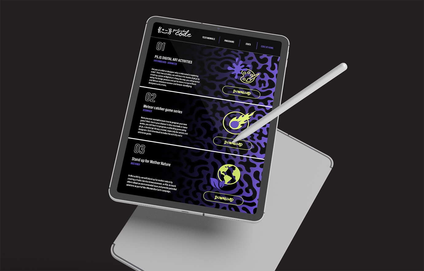
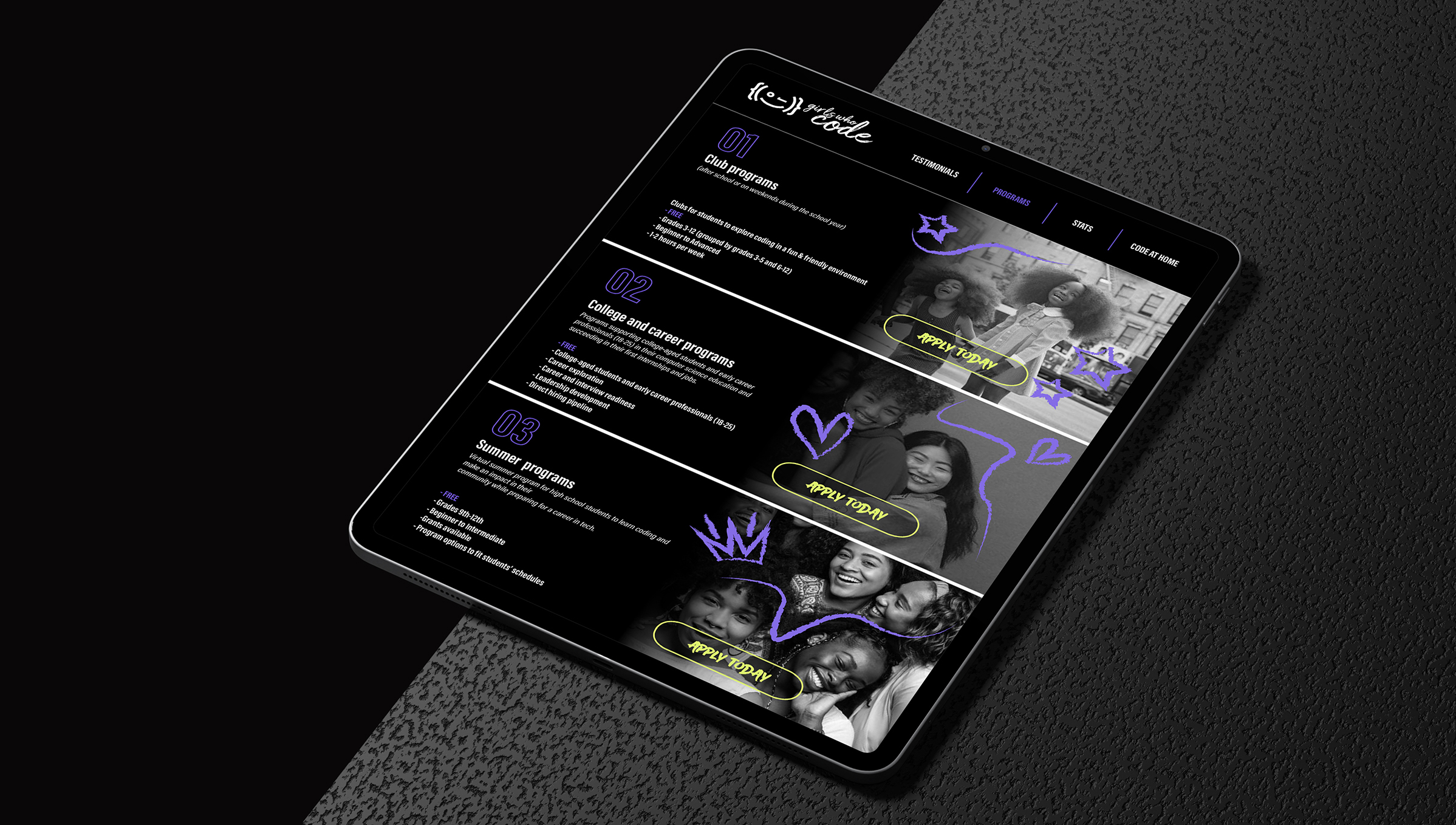
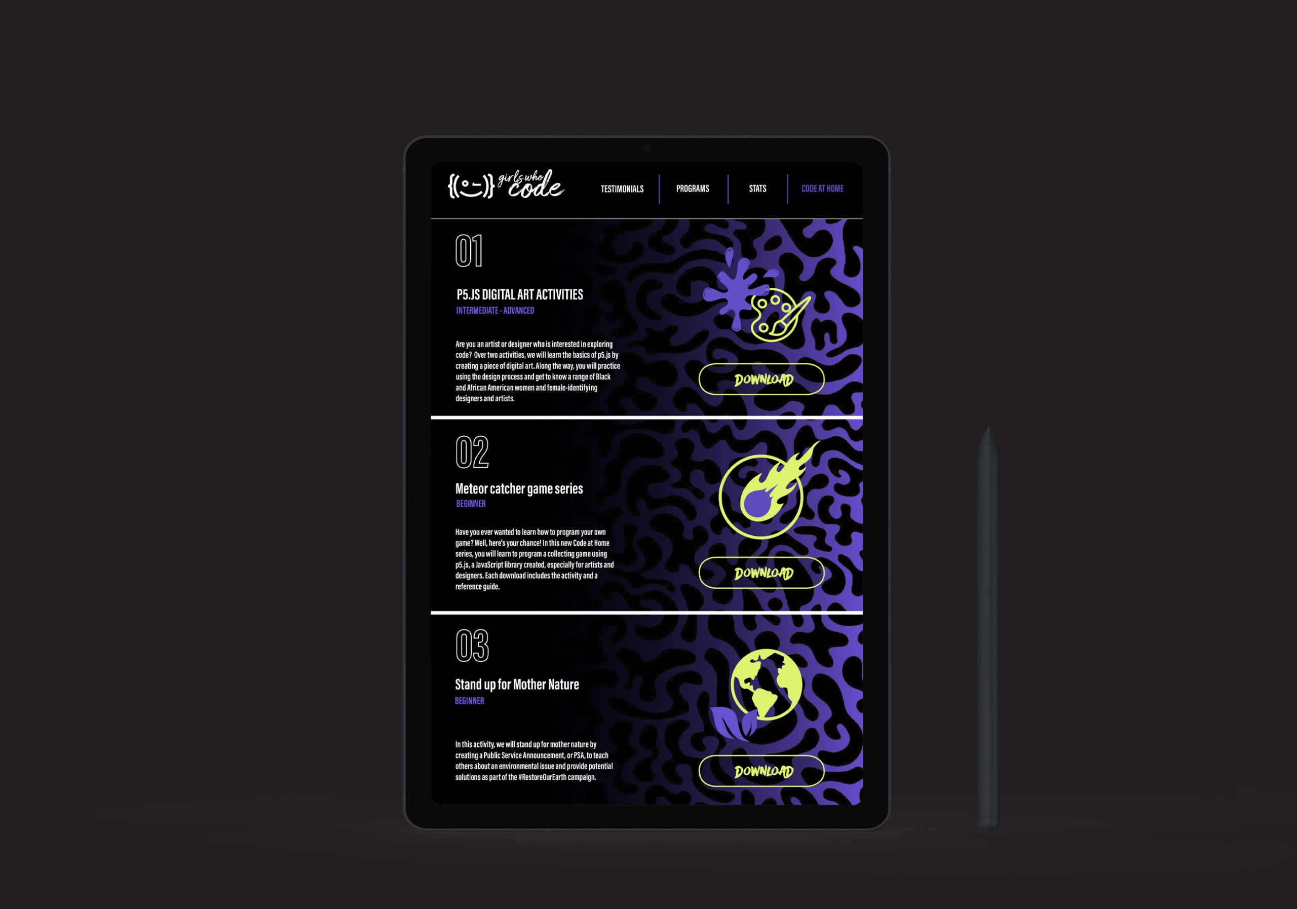
Exercises and courses
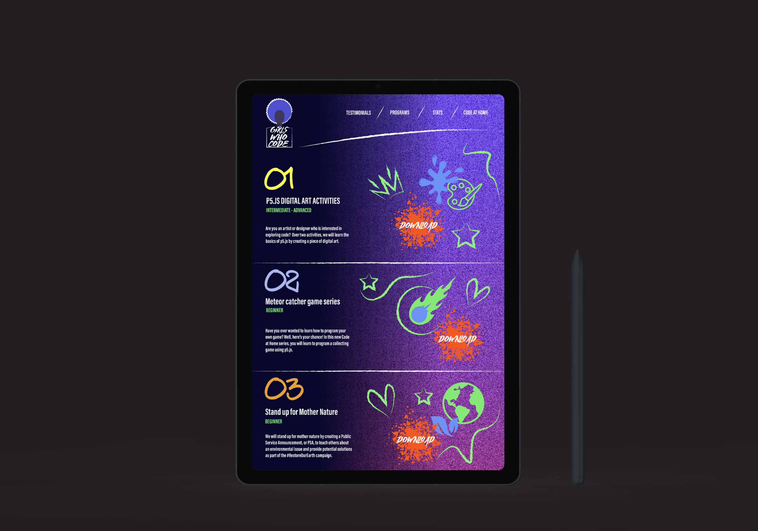
97% of our users expressed an interest on messages and information being deliver in the quickest way. This is why our exercises and courses information are very graphic while highlighting just enough information about them.
Testing

Testing results
✦
01 Color discrepancy
Users noted a disconnection between the app's sober and less colorful interface and the vibrant branding and advertisements.
02 Imagery mismatch
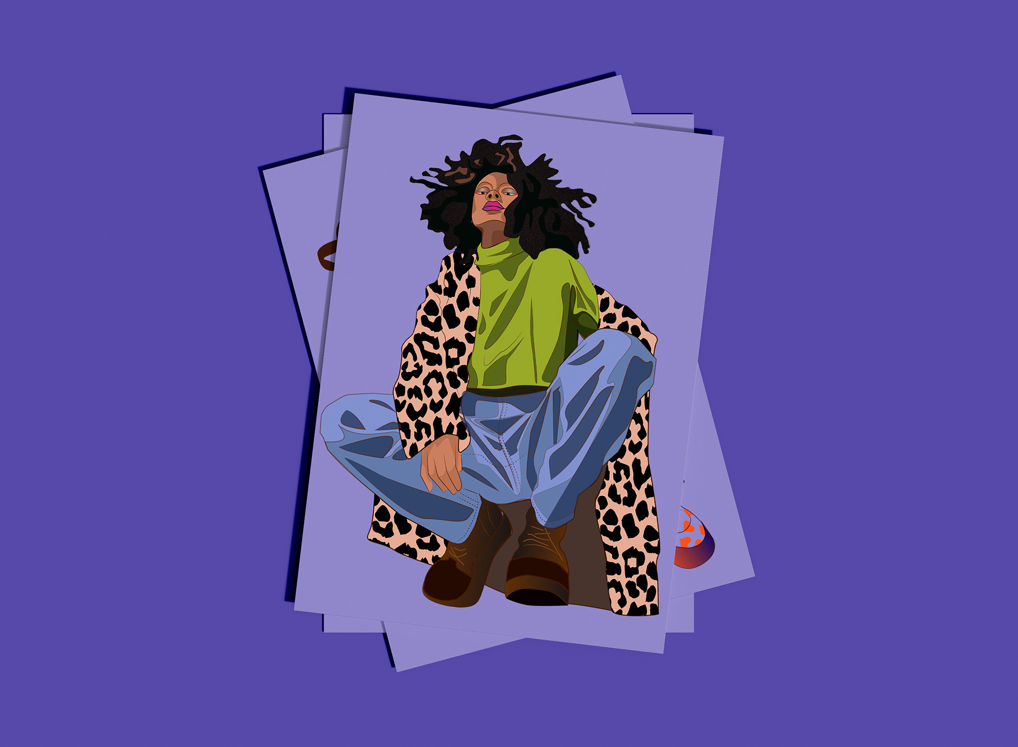
Testers expressed a preference for the attention-grabbing quality of colorful illustrations used in advertisements over black and white photographs.
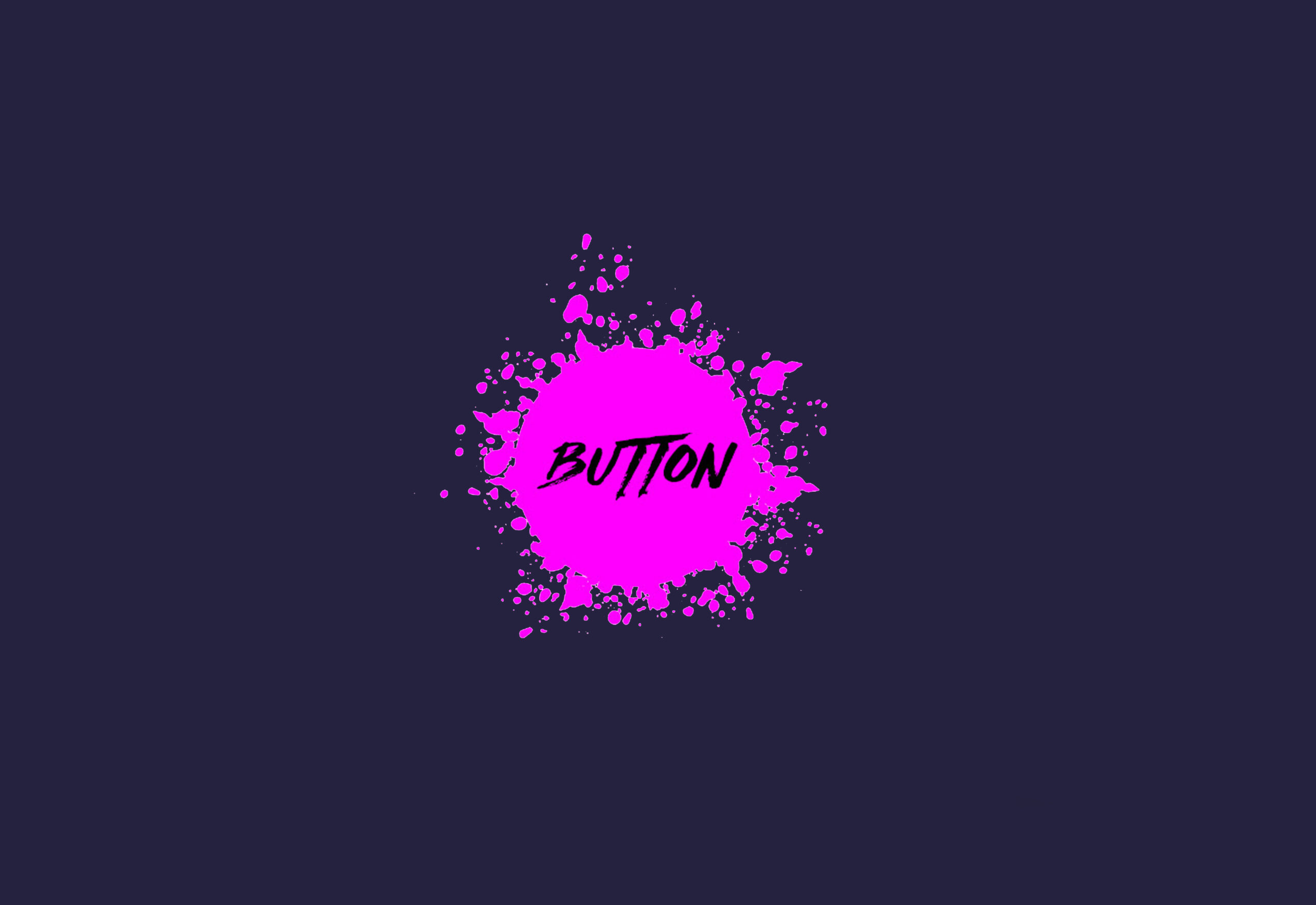
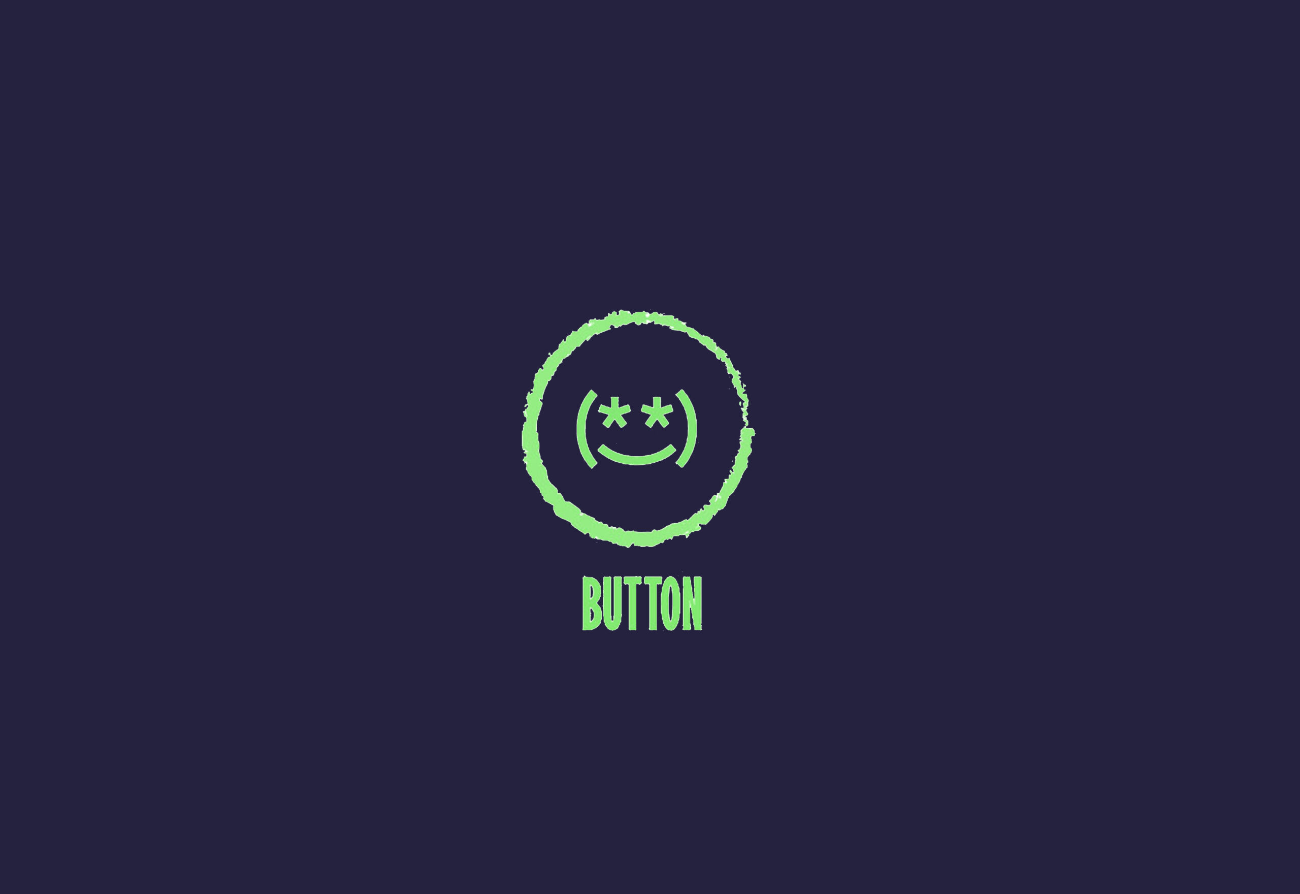
03 Conventional buttons
Users felt that the conventional design of the buttons clashed with the project's unconventional spirit.
04 Logo Inconsistency
Testers pointed out that the logo and navigation elements lacked the fun and untraditional spirit inherent in the overall campaign.
✦
SCHEDULE AN INTERVIEW!
REACH OUT
AND SAY HELLO
✦ DESIGNED AND BUILT BY NATALI OVALLES 2024 ✦