✦
START RIGHT
× My role: Lead UX/UI designer & researcher
× Type of project: Web/iOS/Android app
× Duration: Ongoing
× Company: BOK Financial
A web and mobile application that allow users to manage their retirement plan accounts securely and conveniently. Users can access balance and activity information, personal rate of return, and manage other aspects of the account.
Project overview
Start Right is a financial wellness app that helps individuals manage their retirement savings, including 401(k), 403(b), and Roth accounts. It offers tools to track investments, adjust contribution rates, and learn about retirement planning through insights and educational content—empowering users to make informed decisions for their financial future!

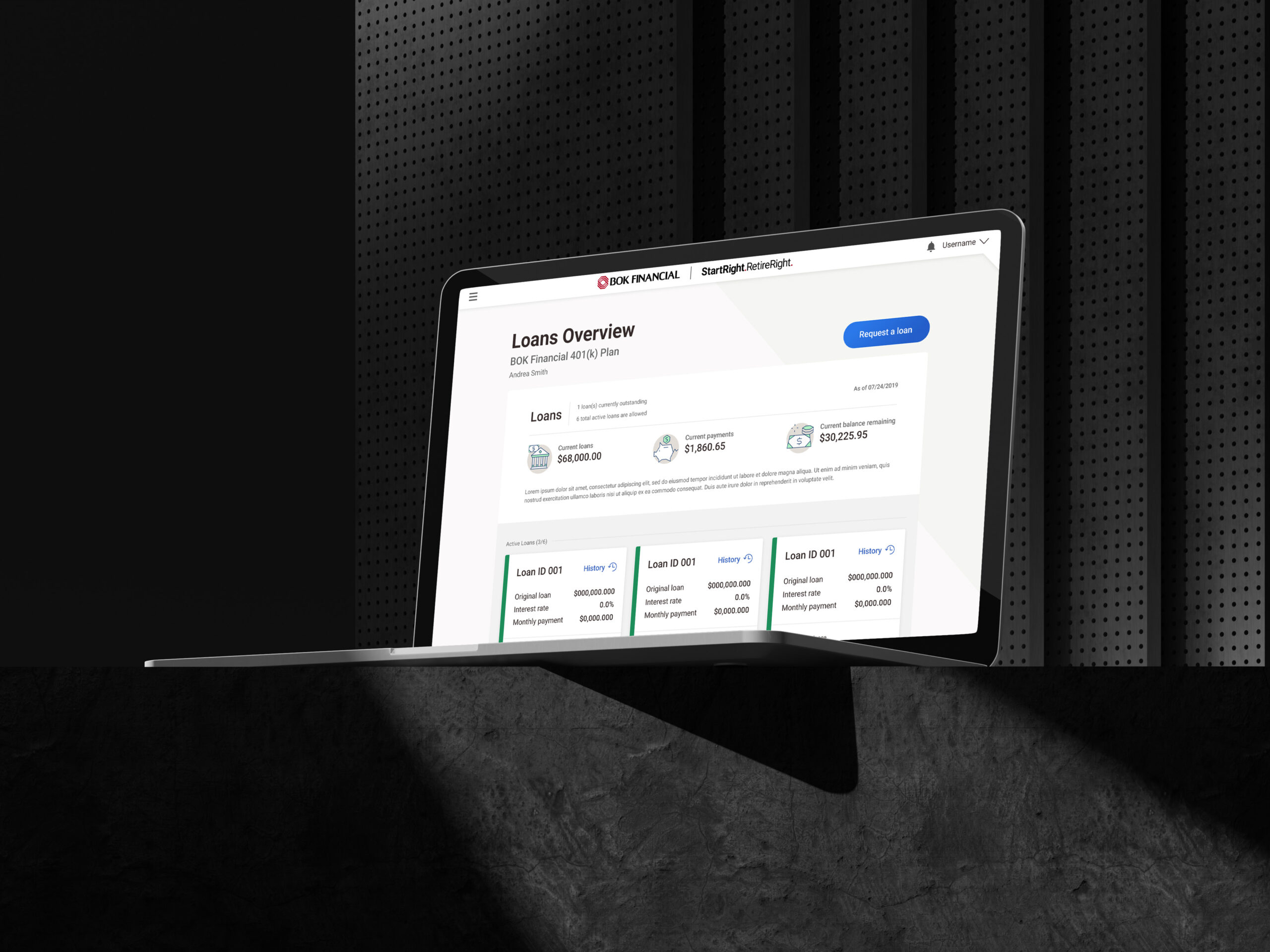
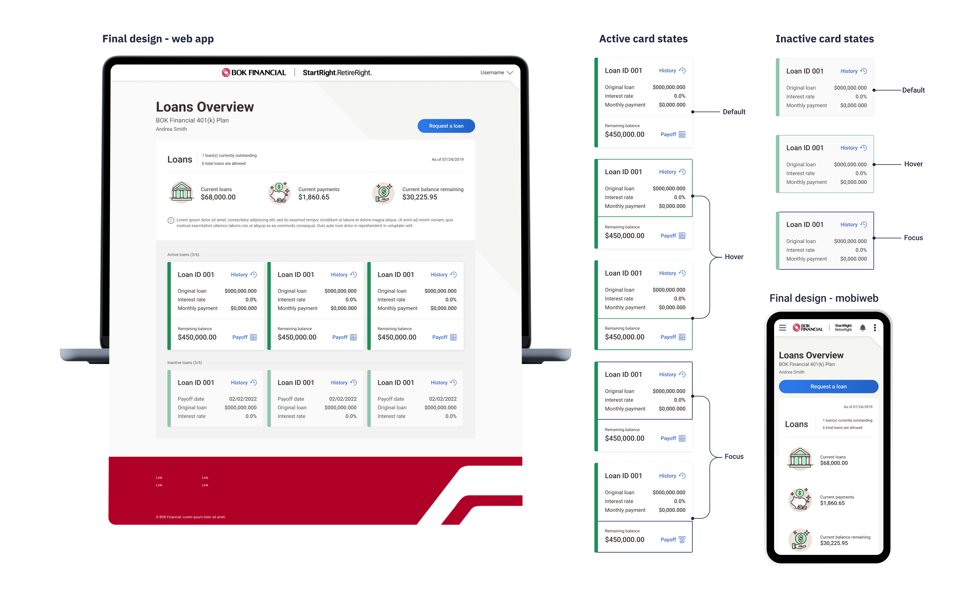
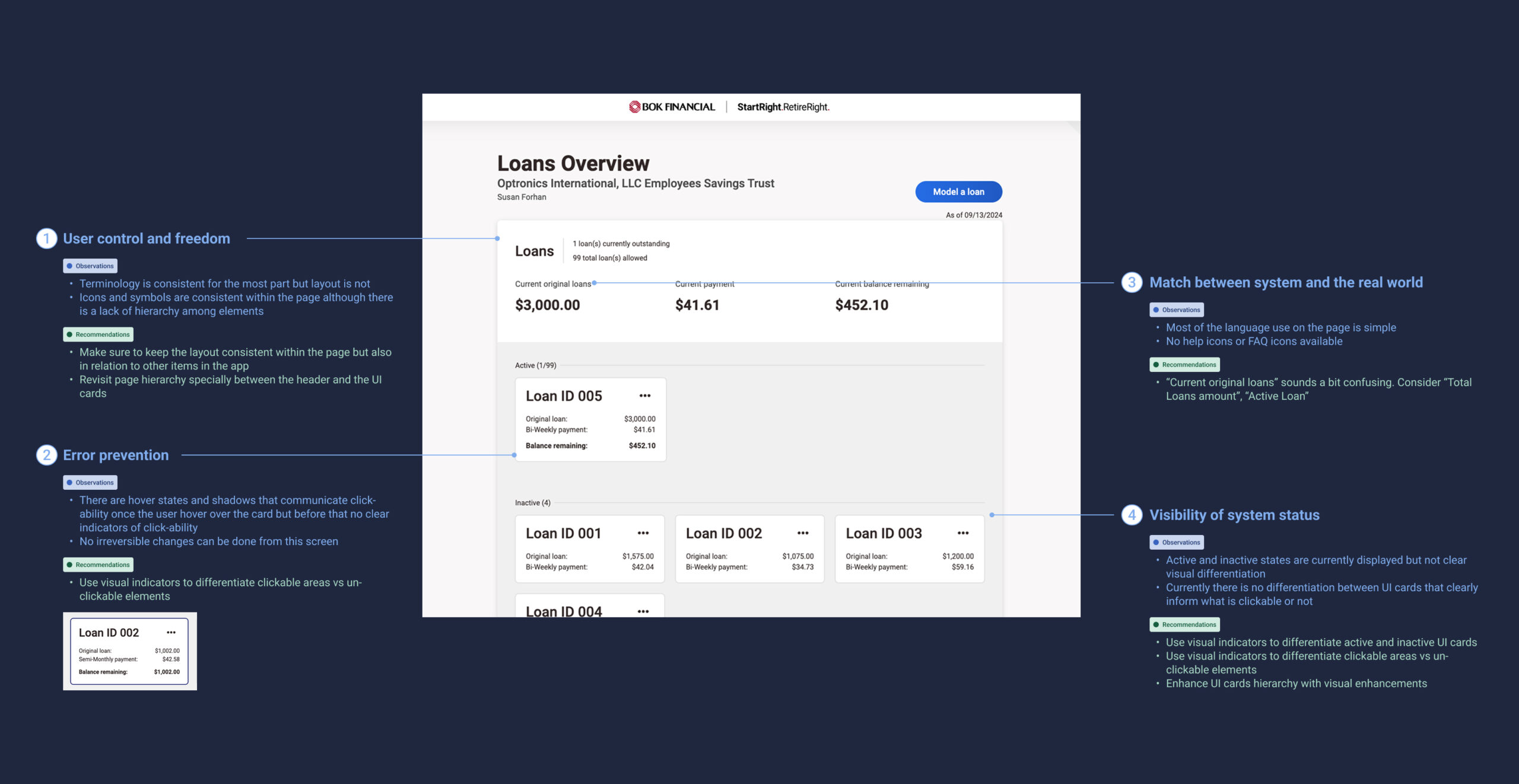
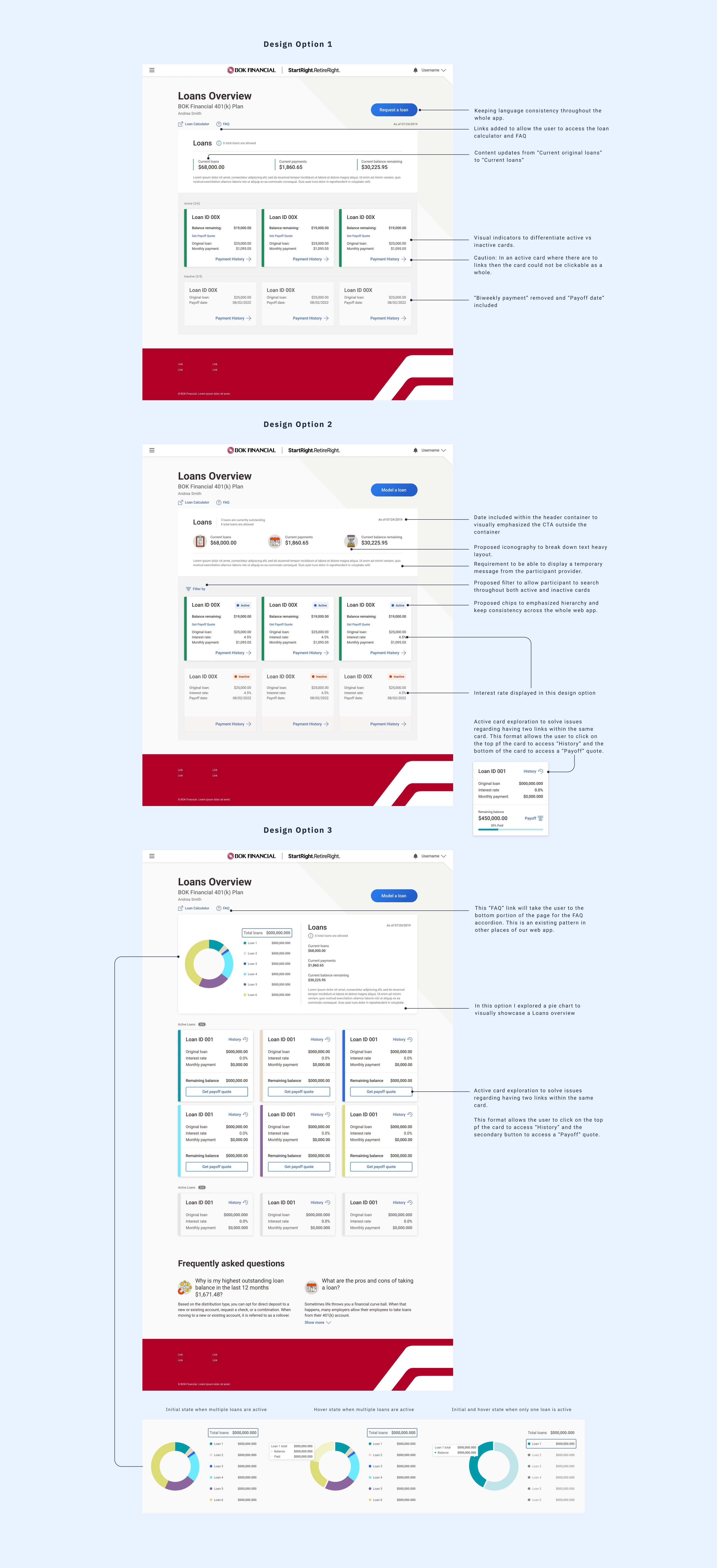
1. Loans overview
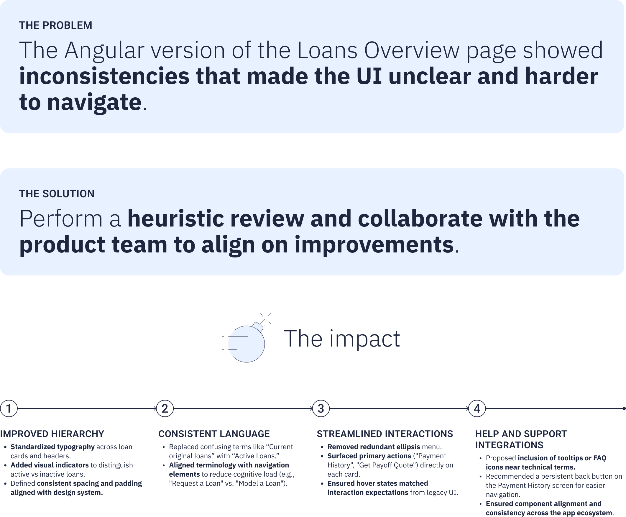
Heuristic review
The first step was to conduct a heuristic review of the current state of the page. Through the review, I identified usability issues and informed data-driven design iterations that enhance the overall user experience. The items shown below are a condensed representation of the whole process.
Design iterations
My design iterations included a simplified version that improved upon the current experience while maintaining familiarity, as well as a more advanced concept featuring an interactive pie chart to enhance data engagement and user interaction.
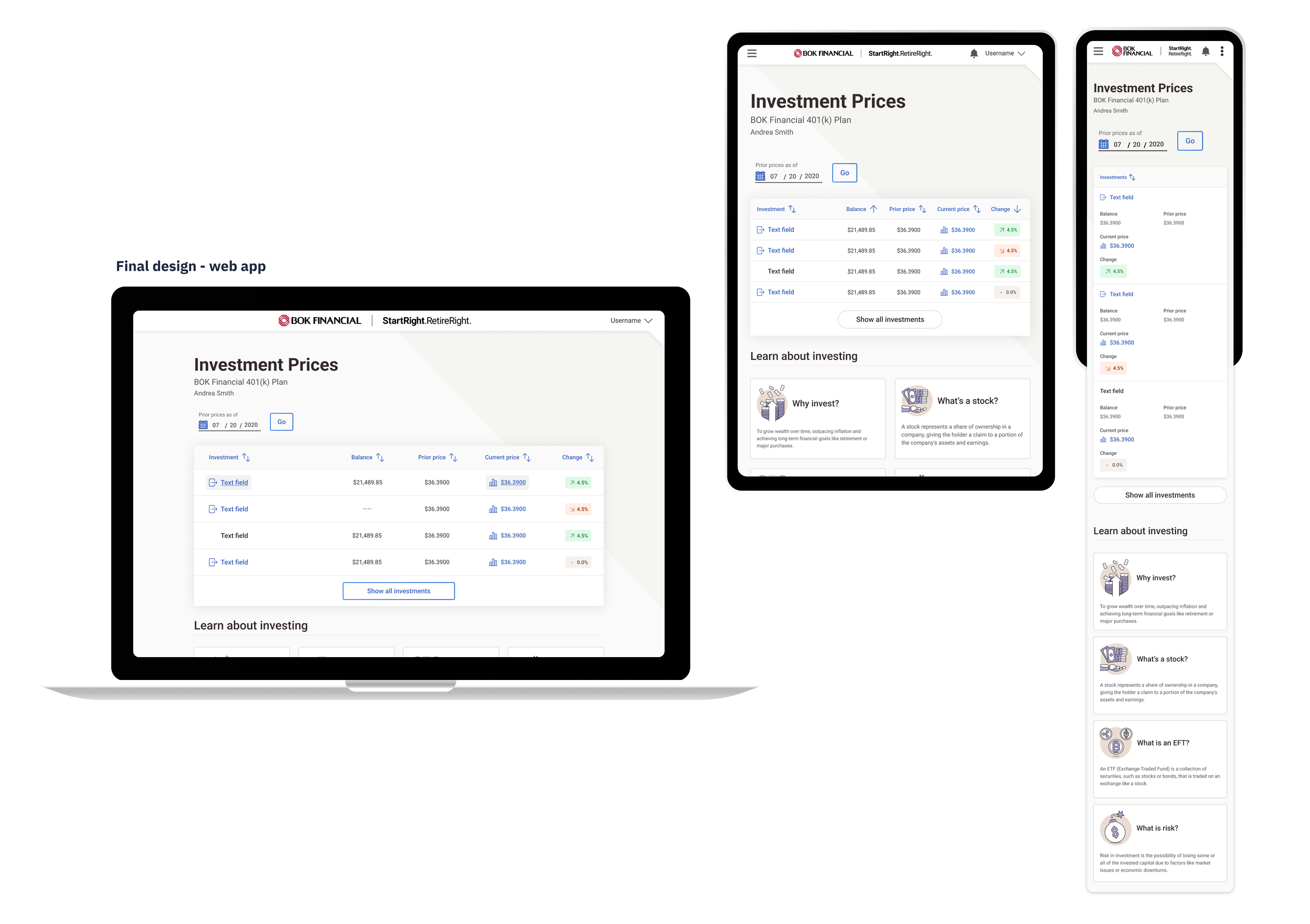
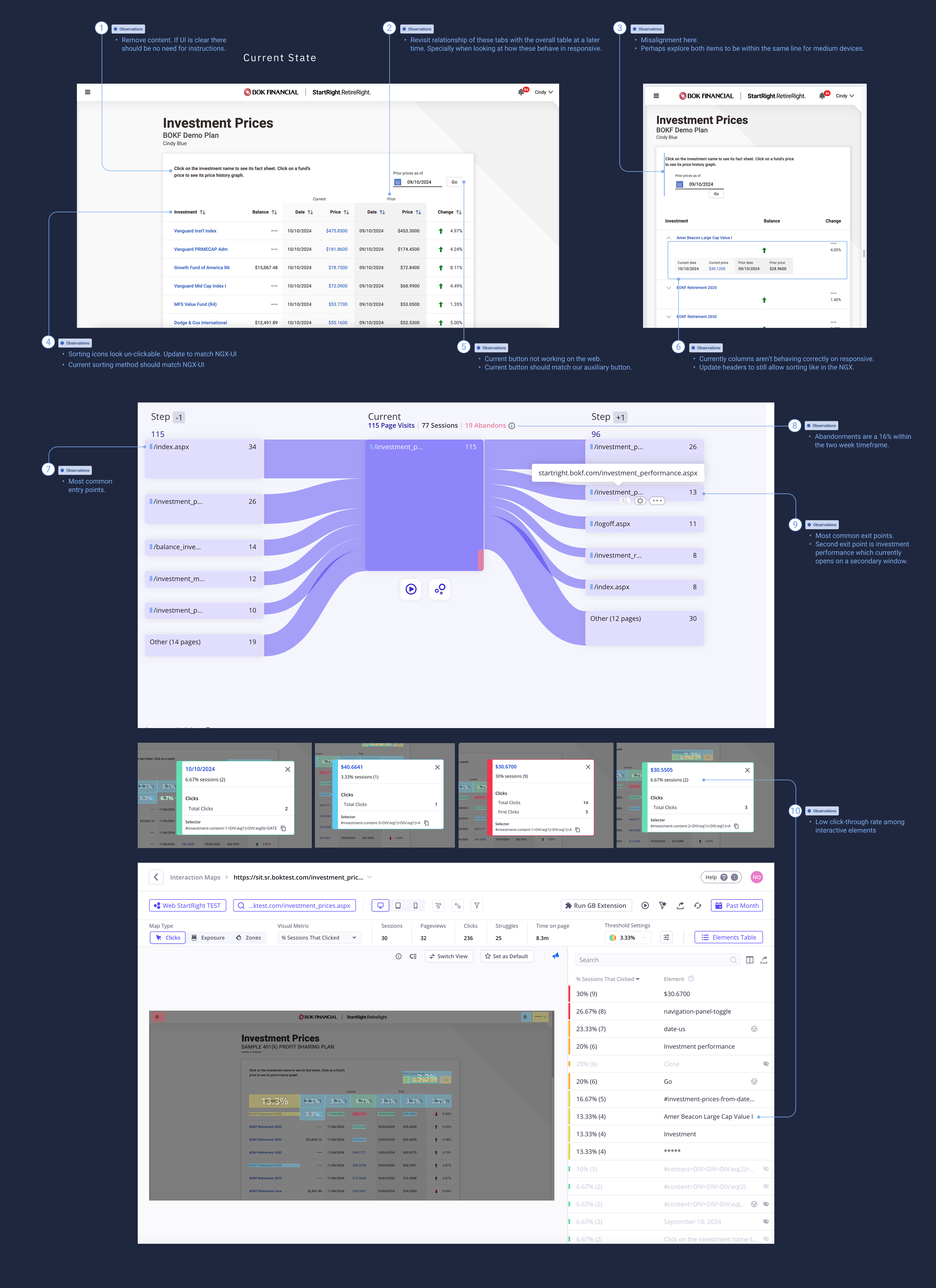
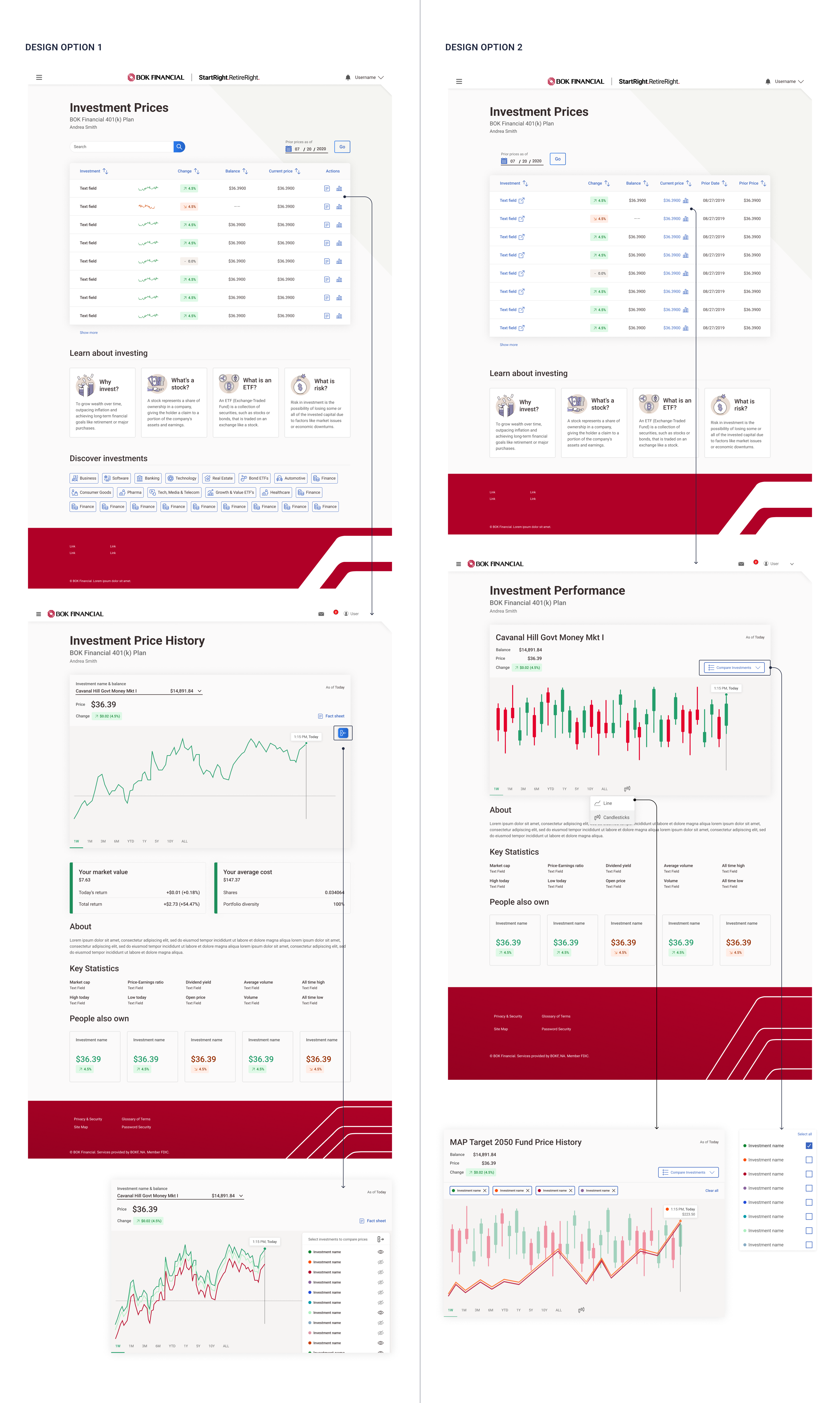
2. Investment prices
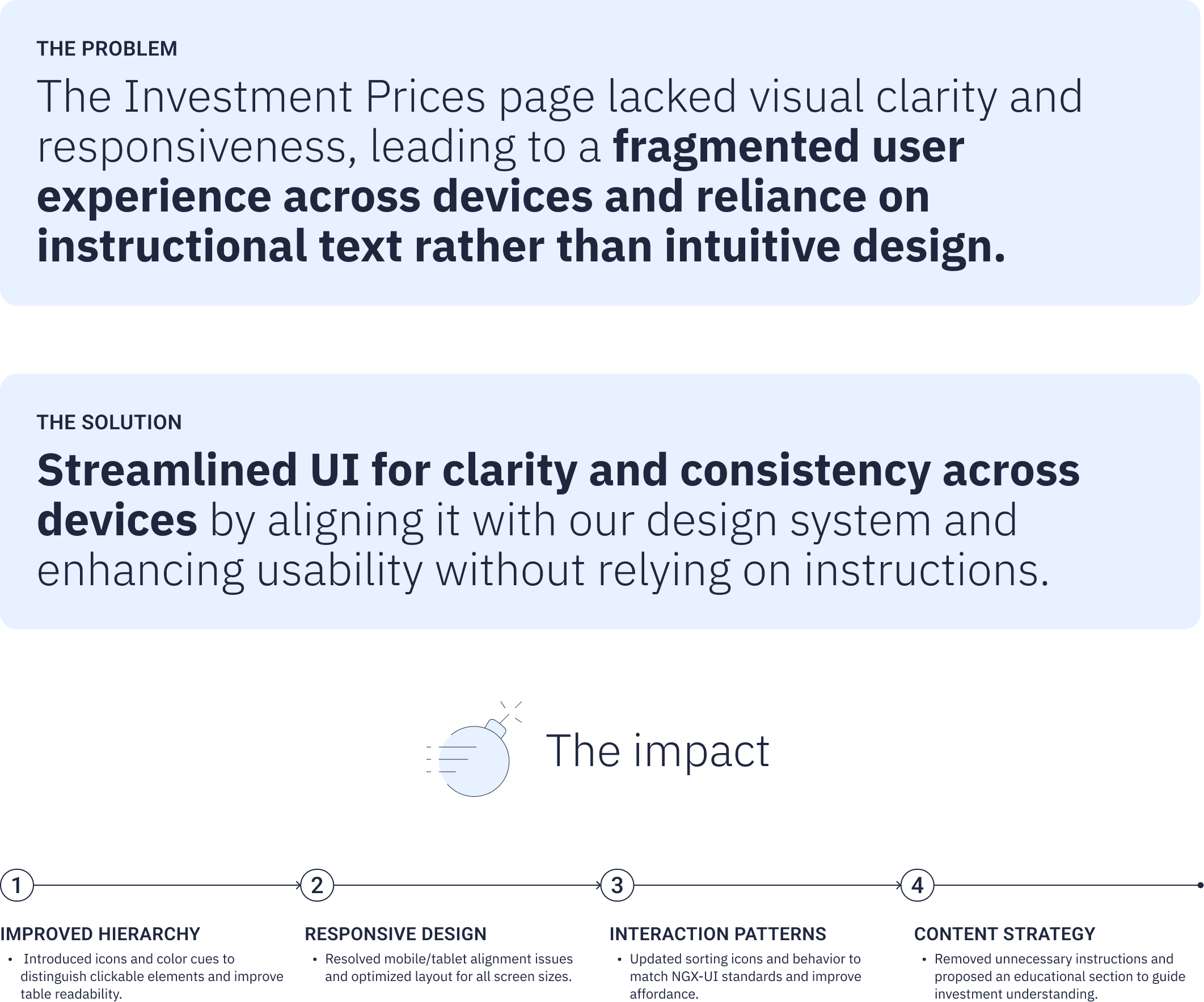
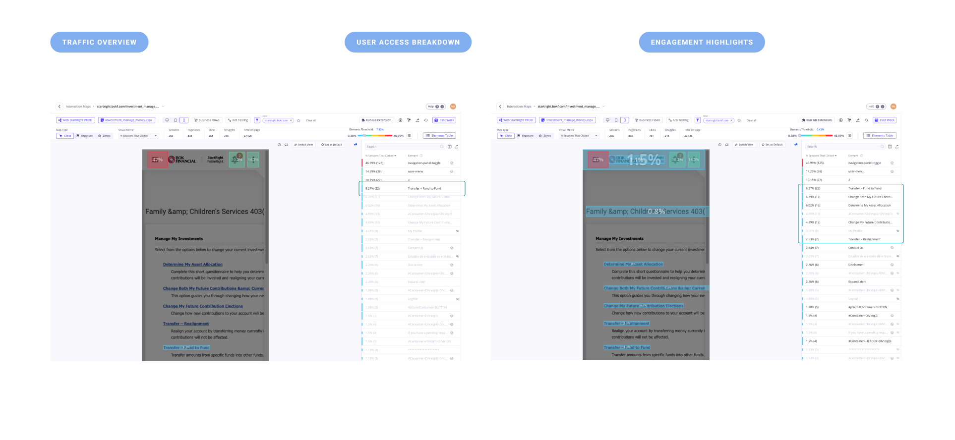
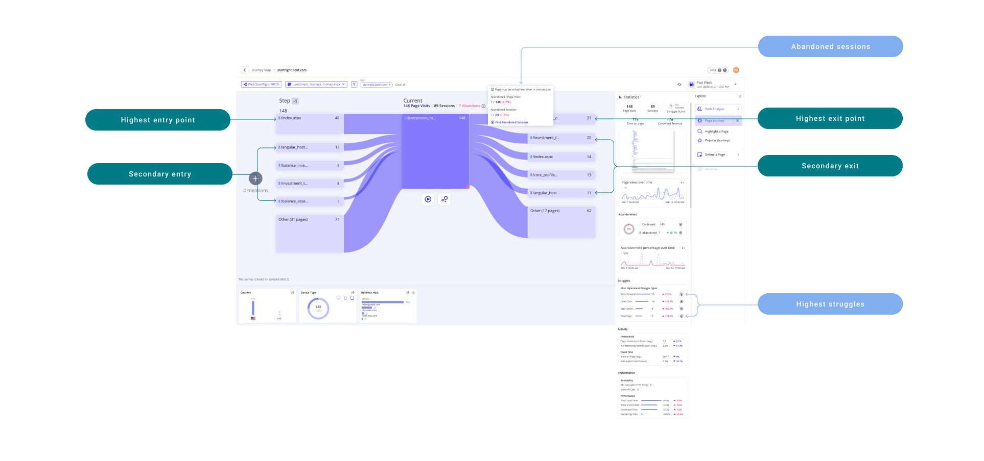
Heuristic review + glassbox analytics
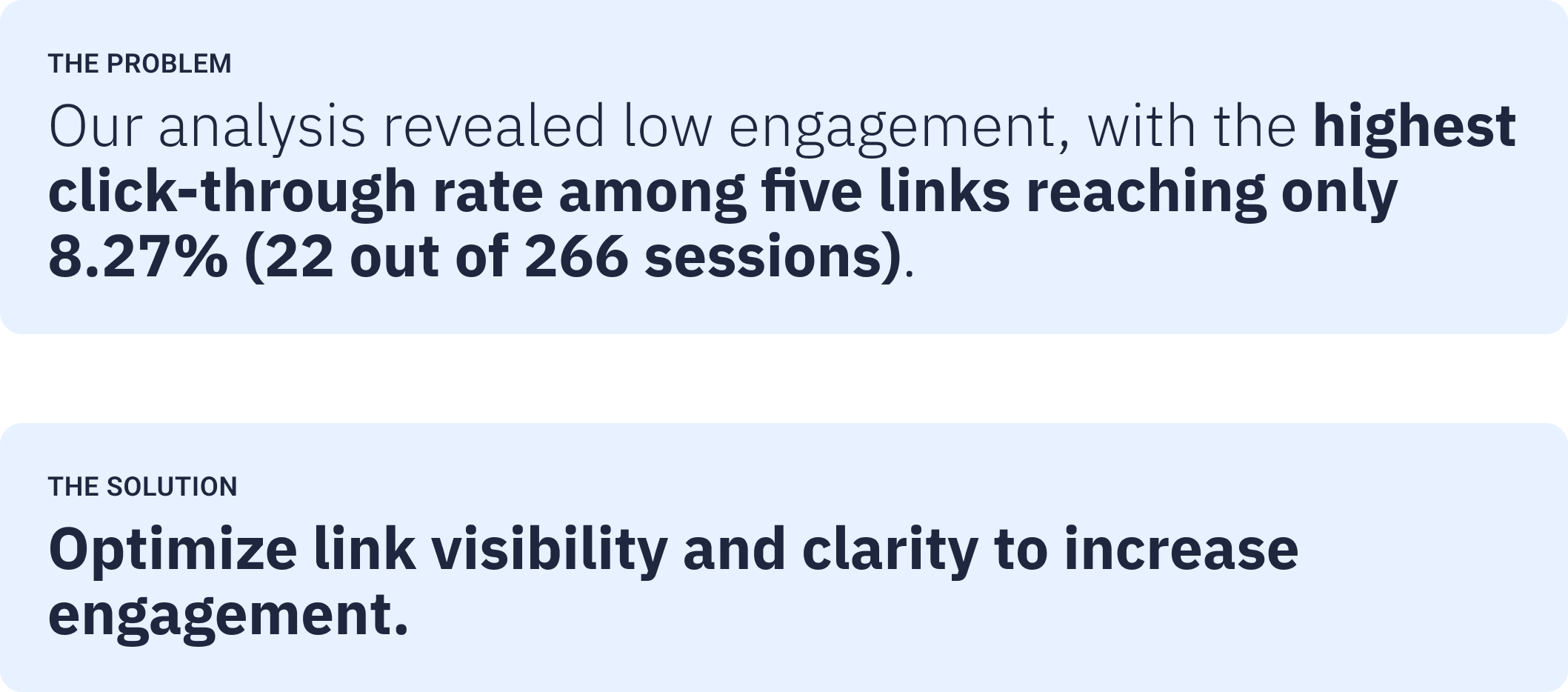
For the investment prices re-design, I conducted a heuristic review and analyzed Glassbox analytics to understand user journey maps, including common entry and exit points as well as abandonment patterns. I also examined interactive heatmaps to assess click-through rates across the page. These insights directly informed my design iterations.
Design iterations
In my design iterations, I leveraged our existing NGX-UI components to ensure consistency and feasibility, while also proposing UI enhancements to improve clarity and visual hierarchy. Additionally, I introduced a new interactive pattern for accessing investment price history, setting a precedent for future interaction models within the app.
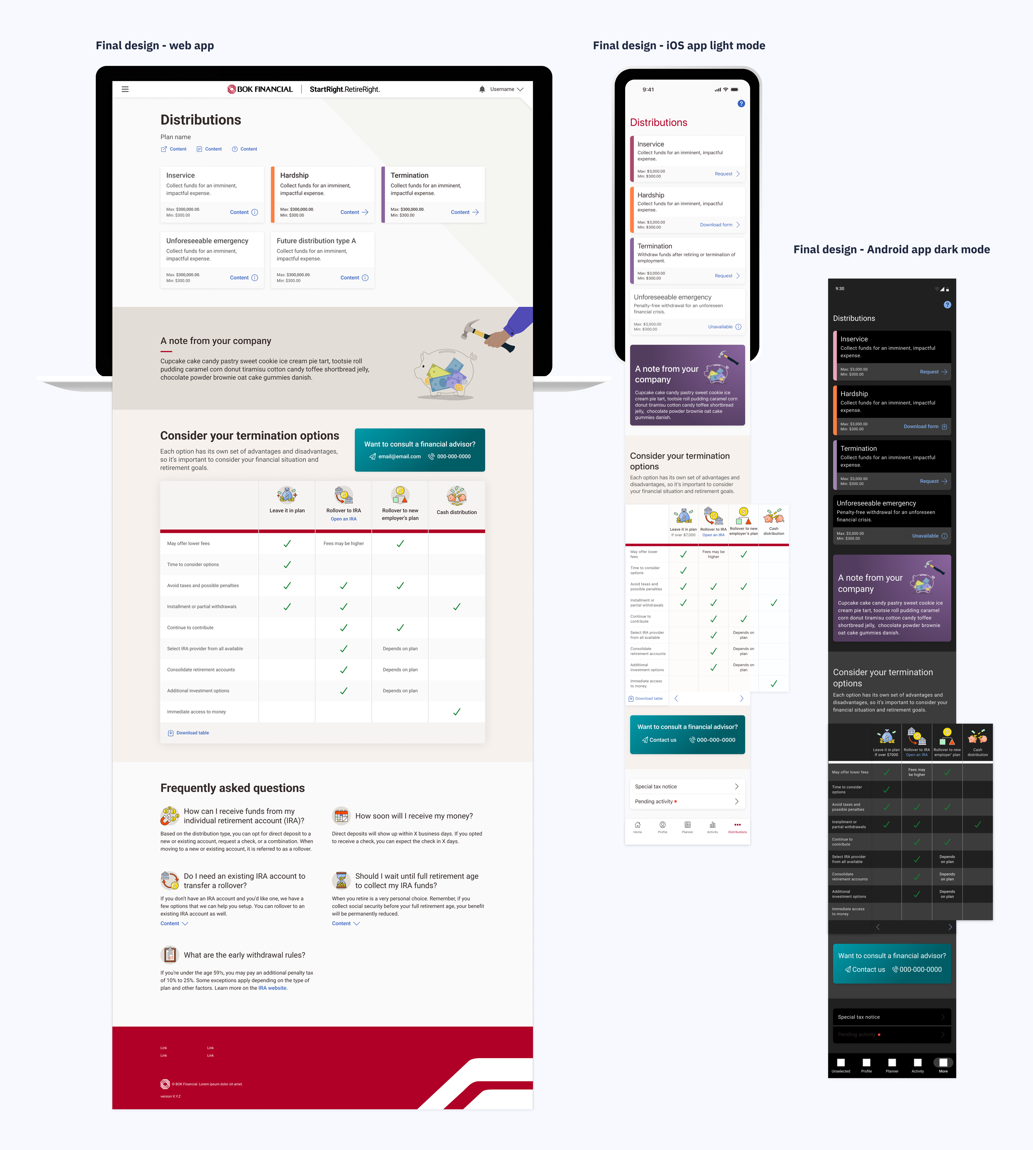
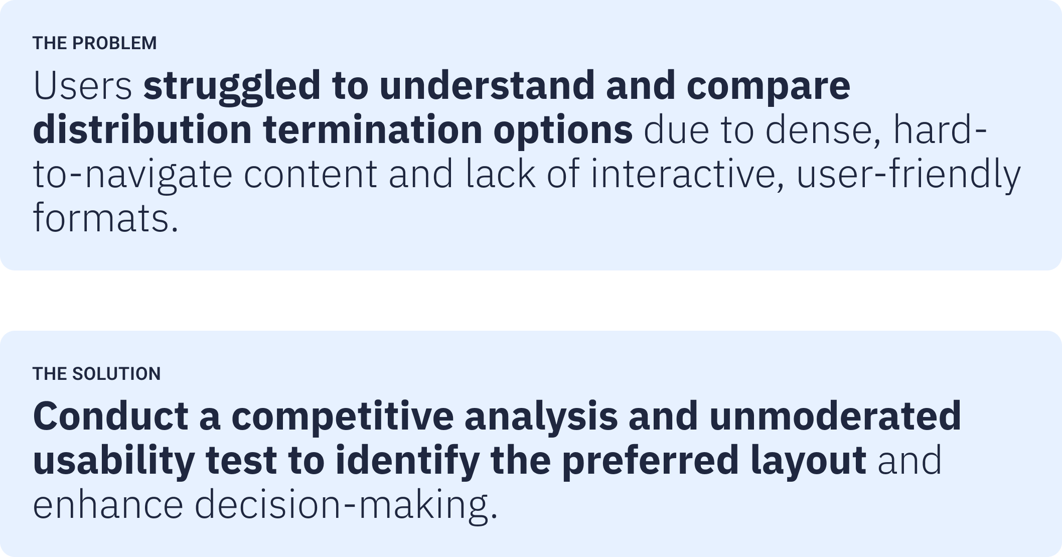
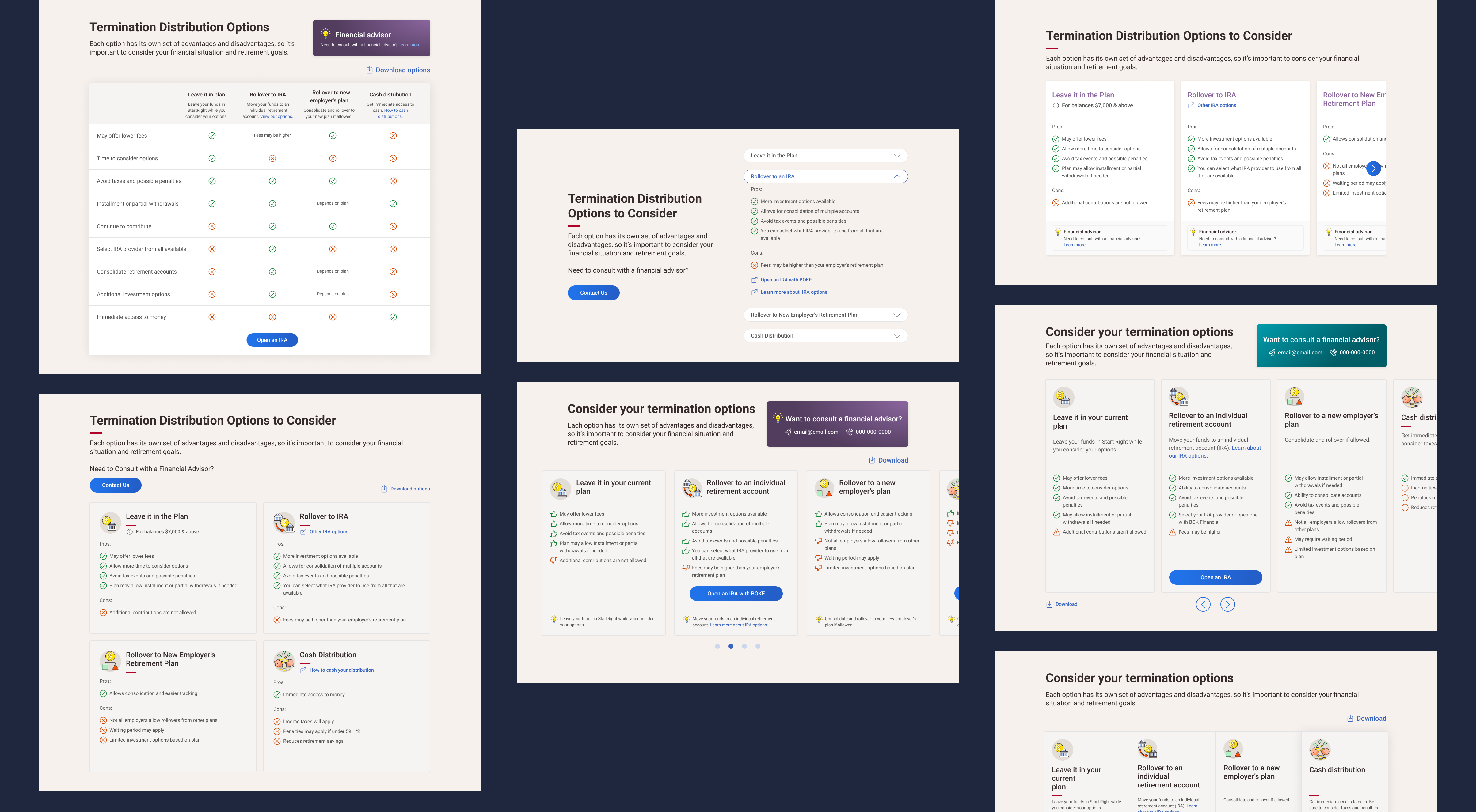
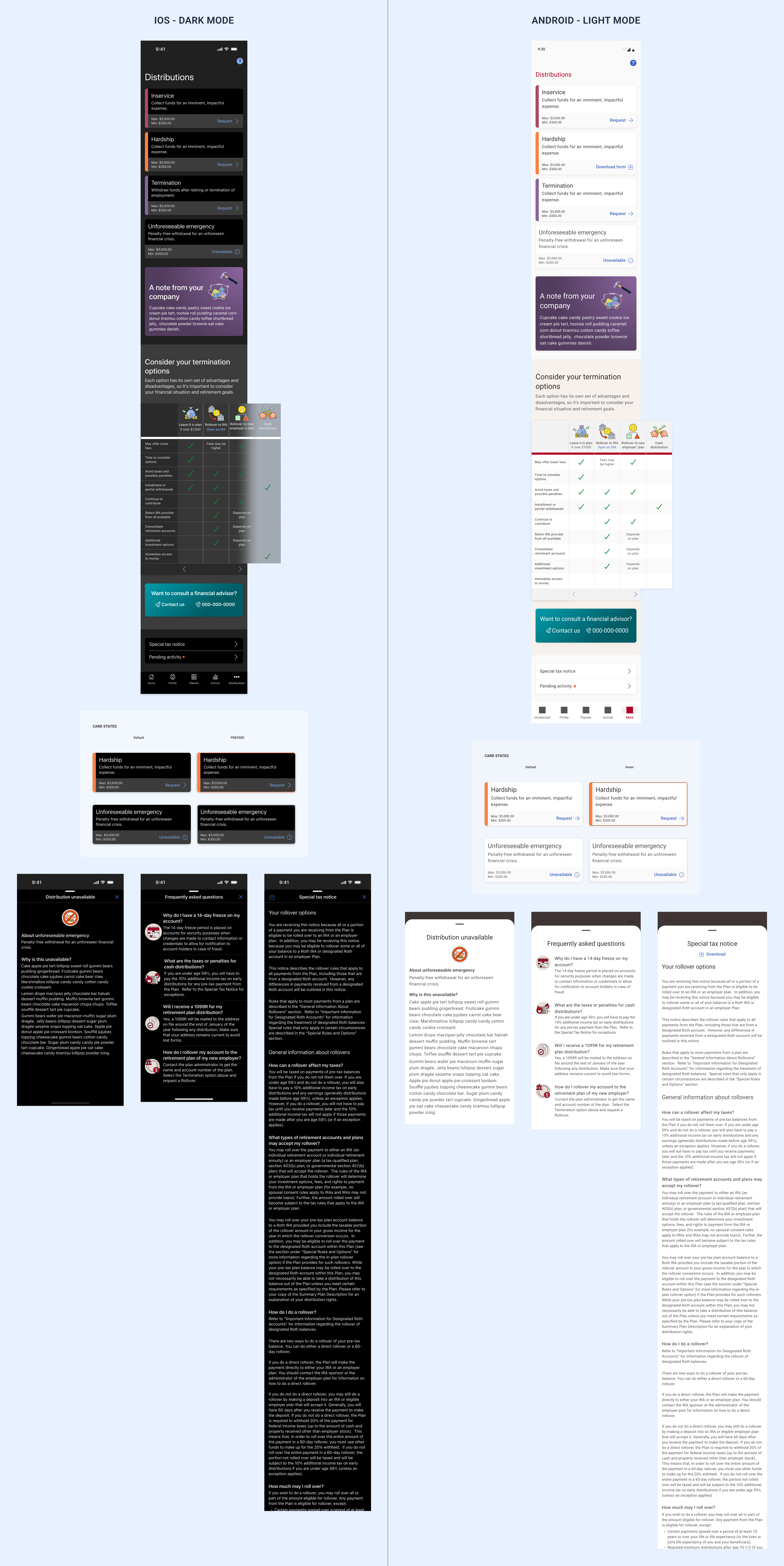
3. Distribution + Educational content
Other patterns studied
Before conducting an unmoderated usability test, I explored and showcased a variety of content display patterns—including accordion styles, carousel-format cards, fully exposed card layouts, table views, and horizontal scrolling—to evaluate which format best supports user comprehension and engagement.
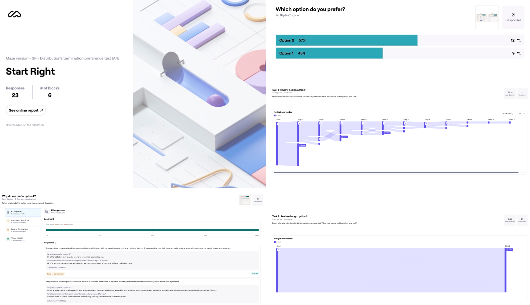
Unmoderated usability test
I ran unmoderated test through mazed. Two prototypes were introduced to the user. Based on user feedback we created an improved version of the selected format that included the visual queues and graphics the users liked.
Native app implementation
For the native app implementation, the key challenge was maintaining consistency with the web design while adapting it to native components for both iOS and Android. I collaborated closely with developers to ensure the table pattern aligned with platform capabilities and remained feasible within technical constraints.
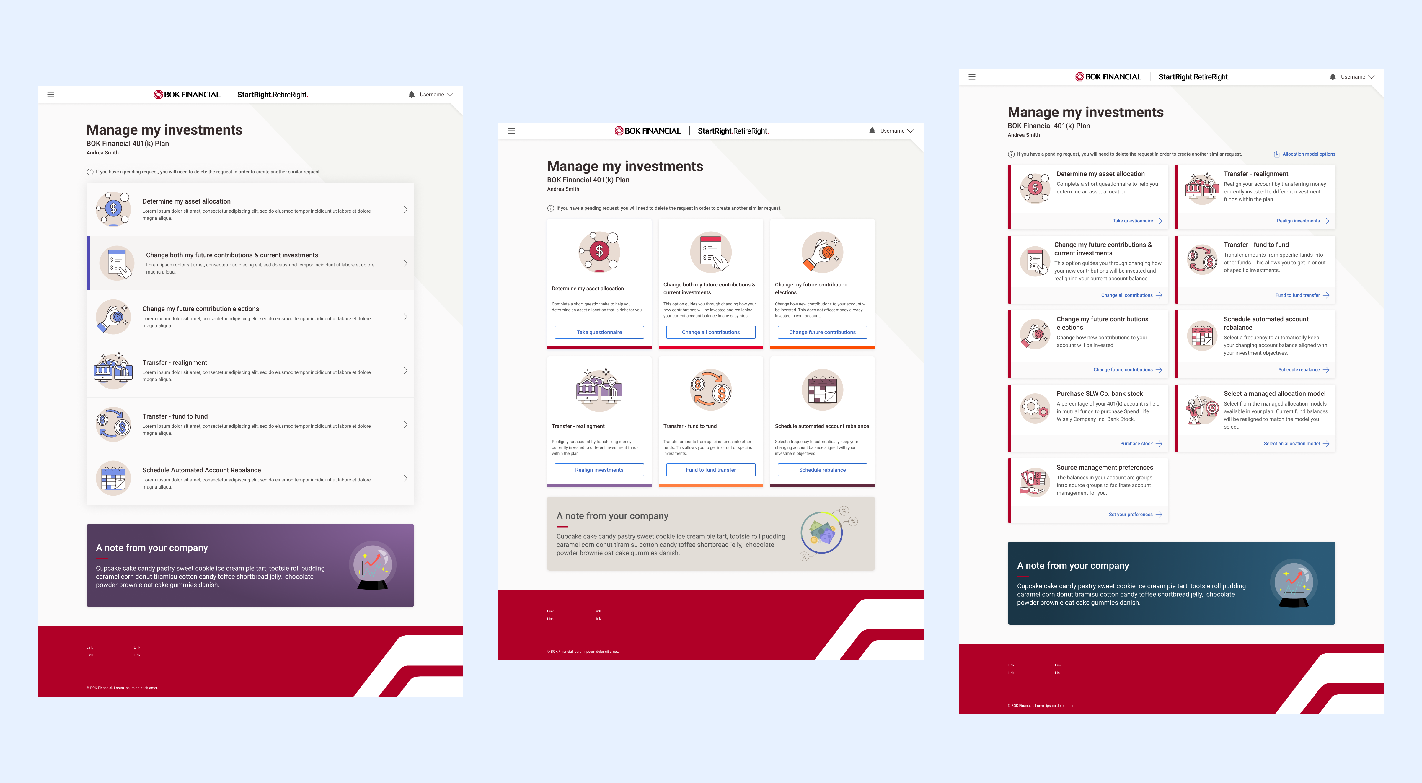
4. Manage my investments
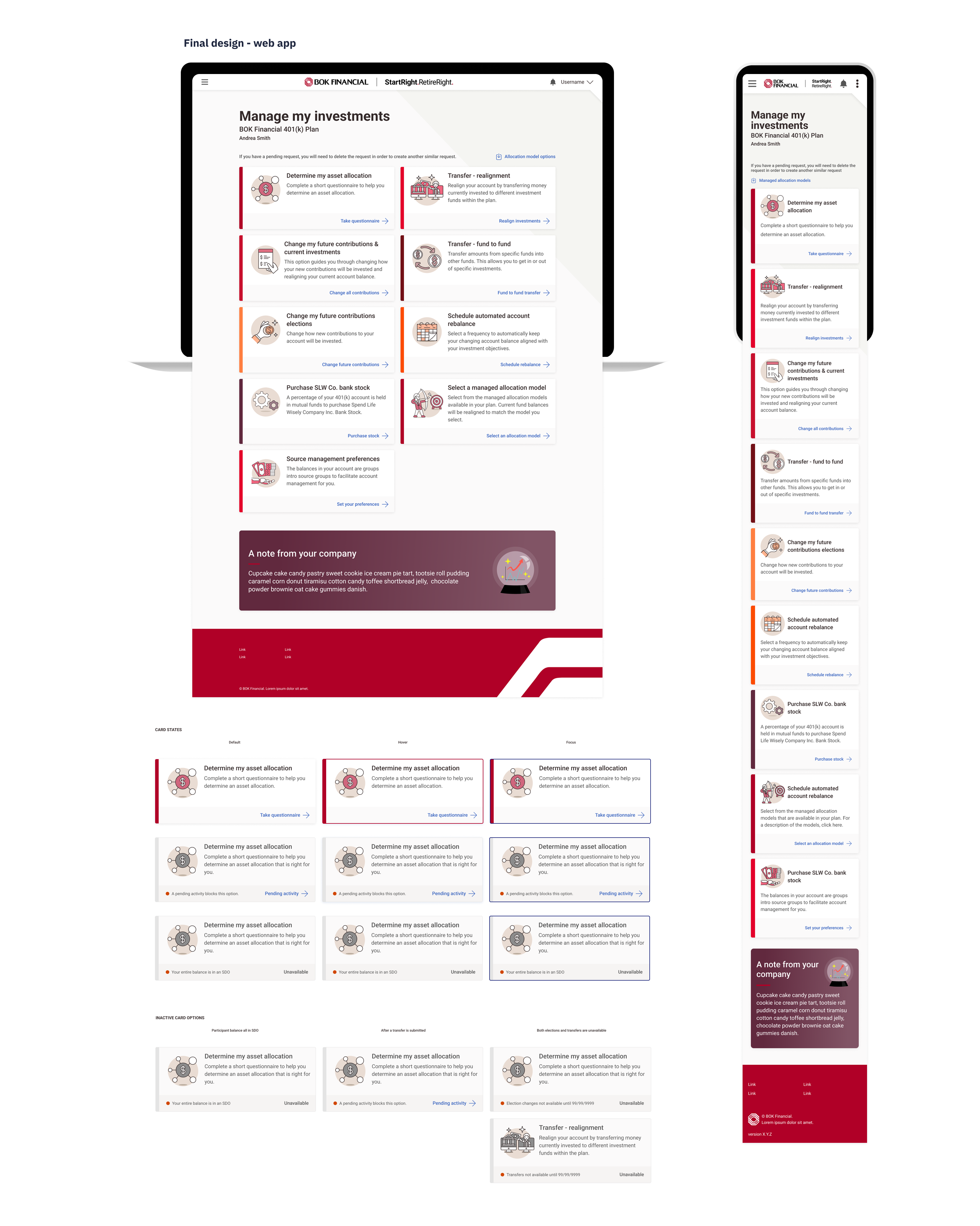
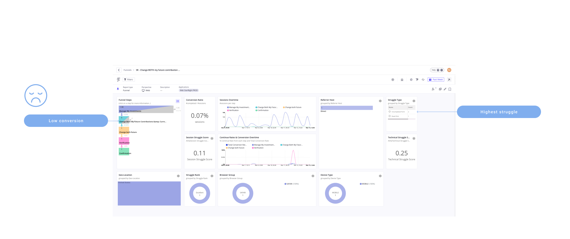
Glassbox analytics + funnel
For the 'Manage My Investments' page, I conducted an in-depth analysis using Glassbox by creating funnels for all available options, identifying low-conversion paths, user struggles, click-through rates, and key drop-off points to uncover areas for improvement.
Other patterns studied
To support the redesign of this page, I studied a range of UI patterns to identify the most intuitive and efficient way to present the available options.
✦
SCHEDULE AN INTERVIEW!
REACH OUT
AND SAY HELLO
✦ DESIGNED AND BUILT BY NATALI OVALLES 2024 ✦